
The immerSUN provides a useful app showing electricity use which includes an annual option. The graph below shows the 2016 annual data: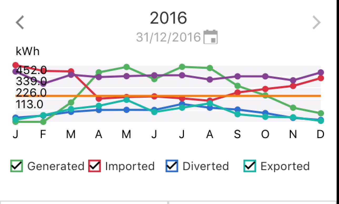
Although some of the data was only collected from mid-March 2016, the graph still shows useful information. I think that the graph overstates bought / imported electricity in January to March but understates generated electricity proportionately in the same period.
The purple line shows monthly electricity consumption and is broadly consistent month-to-month.
The green line shows the generated electricity from the solar PV system. Its seasonality is clearly visible. Solar generation exceeds electricity use in four summer months, and is very close in a fifth.
The red line shows bought electricity. It’s generally a mirror image of the green line reflecting more purchased electricity in winter and less in summer, but is not zero even in months where generated electricity exceeds used electricity due to time of day issues – cooking and car charging often occur at times when solar output is low such as cooking in the evening and charging at night.
The blue line shows surplus day-time electricity being used to heat water, and thus saving gas.
The turquoise line shows surplus day-time electricity being exported once the water has reached its set point.
It will be interesting to see how this changes in 2017 as a result of a full year of solar car charging in its current mature condition and with the new battery storage that should help get more of the generated electricity used by saving it for evening use.