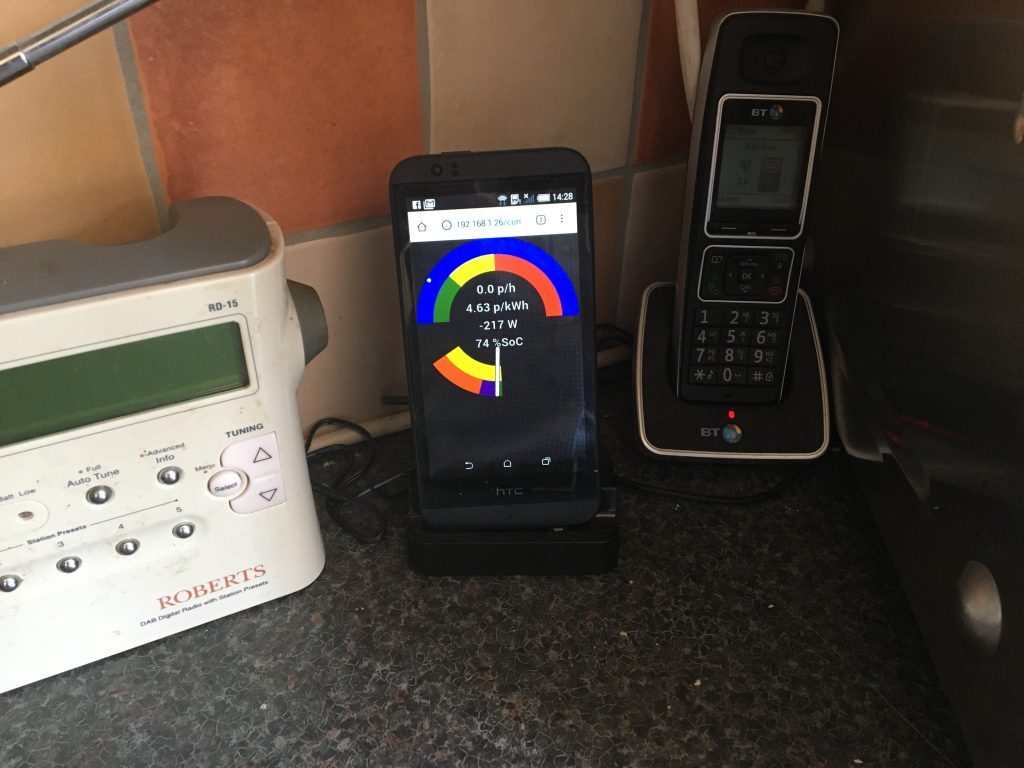
For some time now I’ve been thinking about creating a real time display which pulls together data from a variety of sources around the home to provide an overview of what’s going on without the need to visit multiple web pages or apps. Until the last 10 days or so that involved little more than thoughts of how I might evolve the existing immersun web page with more content (I don’t have the skills to write my own app), but then about 10 days ago I saw an online gauge that someone else had created to show energy price and inspiration struck. Ten days later I have my monitor working, albeit not complete:

The monitor pulls together information from:
- My electricity tariff for p/kWh
- My immersun for power data (to/from: grid, solar, water, house)
- My storage battery for power in/out and state of charge
- My HEMS for electricity cost thresholds between different battery modes.
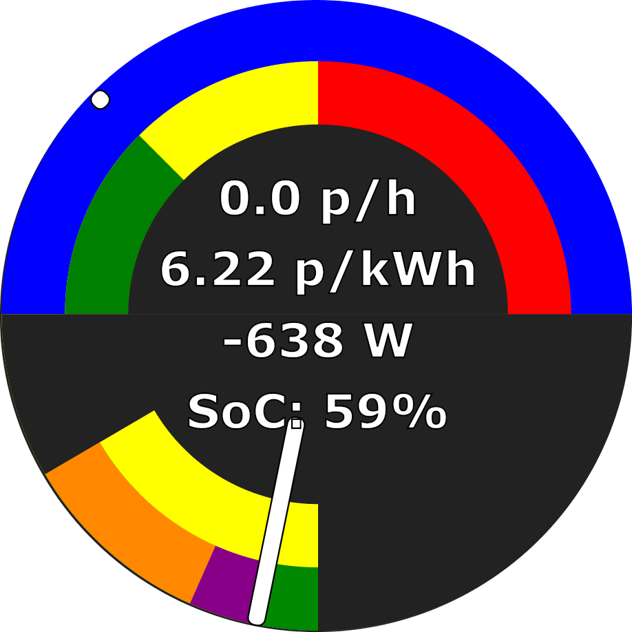
The gauge consists of two parts: (i) an upper electricity cost part and (ii) a lower power part.
The upper electricity cost part is effectively a big price gauge from 0 p/kWh to 25 p/kWh with a needle that moves each half hour as the price changes. It has various features:
- The outer semi-circular ring (blue here) shows today’s relationship between battery mode and electricity price. Today is very sunny, so no electricity was bought from the grid to charge the battery, and this part is all blue for normal battery operation. If the days was duller and electricity was to be bought to charge the battery, then two further sectors would appear:
- a dark green sector from zero upwards showing the grid prices at which the battery would be force charged from the grid, and
- a light green sector showing when the battery is not permitted to discharge but may continue to charge from solar.
- In inner semi-circular ring (green / yellow / red here) currently just colour-codes increasing electricity price, but will be used to show today’s prices at which car charging and water heating are triggered from the grid.
- The current price per kWh is taken from Octopus’s price API, while the current cost per hour is derived both from this and the grid power from the immersun.
- The needle grows from a simple dot indicating the price per kWh only when no power is drawn from the grid to a full needle when the electricity cost is 10 pence per hour or more.
The lower power part is effectively a power meter ranging from 5,000 Watts of export to the left to 5,000 Watts of import to the right. It updates every few seconds. It has various features:
- The outer semi-circular ring (orange /maroon / green here) shows how power is being consumed:
- orange – shows consumption by the house less specified loads
- maroon – shows battery charging
- blue (not shown) – shows water heating
- green – shows export to the grid
- The inner semi-circular ring (yellow here) shows the source of power. The sum of the sources should equal the sum of the consumers. The sources are:
- maroon (not shown) – shows battery discharge
- yellow – shows solar power
- red (not shown) – shows grid power
- The power value shows the net import or export from / to the grid, while SoC refers to the state of charge of the battery (0-100%). The combination of import power and electricity price gives the cost per hour in the top gauge.
- The needle position shows net import (to the right) or next export (to the left). The needle should thus be to the left of the green sector, or to the right of the (unseen) red sector. Needle length show the full power being handled and is thus proportionate to the angle of the sector including all the colours in the lower gauge and extends from 0 to 5 kW.

The gauge scales to fill the smallest of screen height or width and translates to be centrally positioned regardless of screen size. My intention is to display it on an old mobile phone as an energy monitor, but I can also access it on any web browser on any device within the home.
